
Date: September 2018
Client: Department of Defense
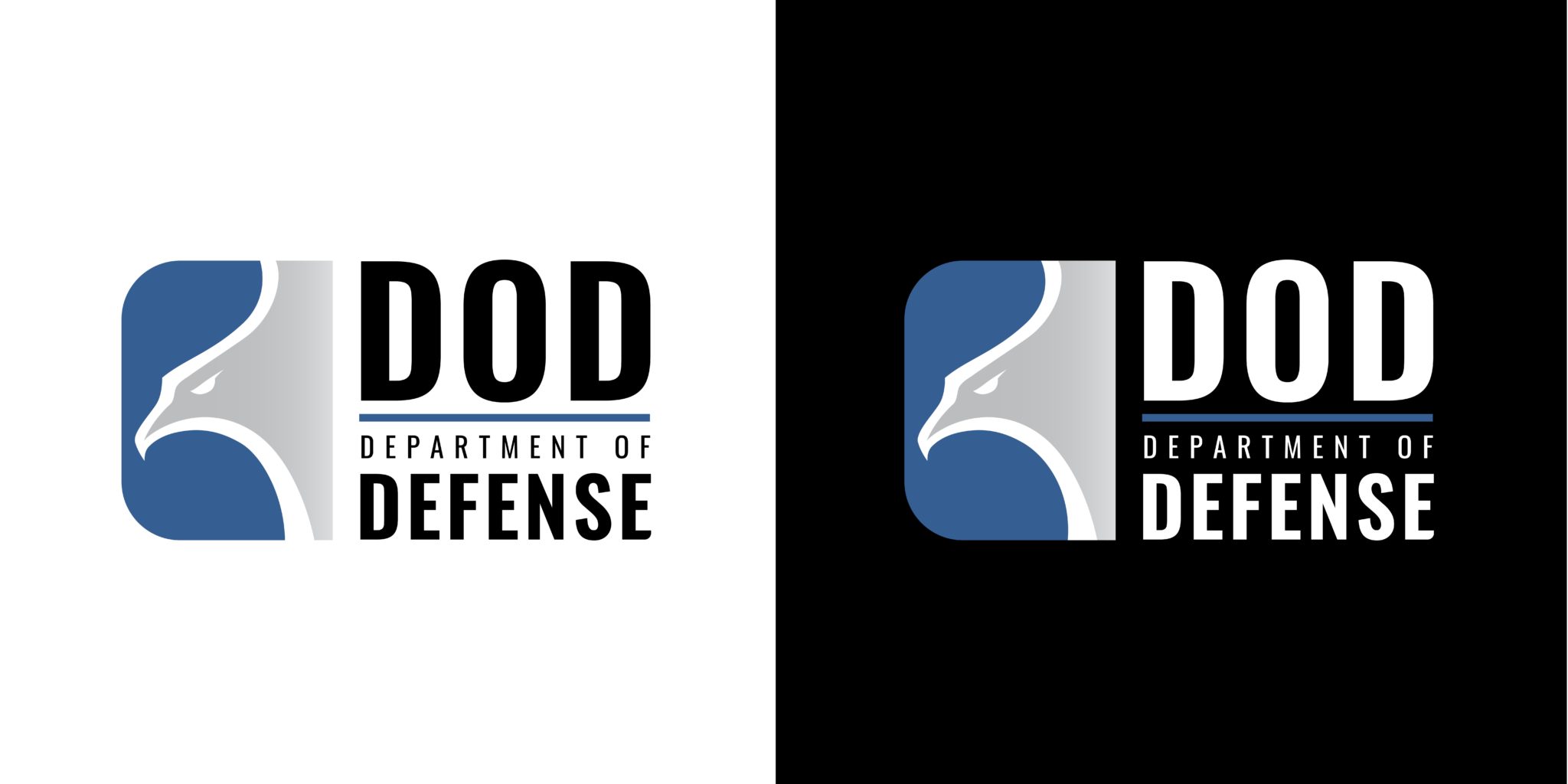
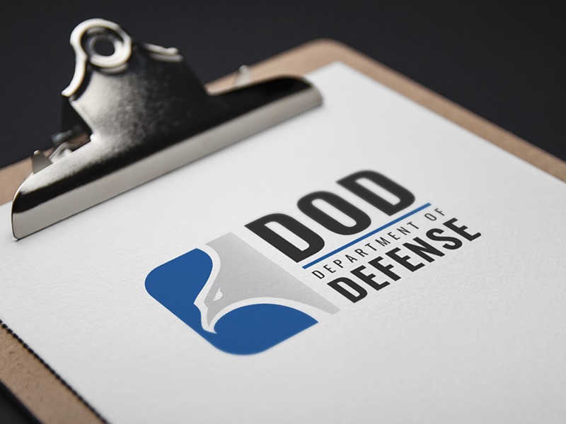
While rebranding the Department of Defense, my team and I put forth several options to the client. My final contribution, nicknamed “the bullet,” was developed over a length of time during which I did research, creative brainstorming, a variety of sketches, digital mockups, revisions, and a final presentation.
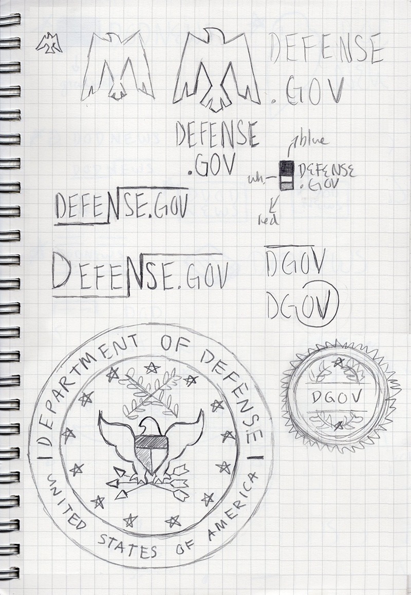


After doing a variety of sketches, I fleshed out a few options on-screen. The logo I ended up going with started red and blue, and went to blue and grey. I also made some tweaks to the design to make it feel more lethal and sleek, which were themes the client wanted to convey.
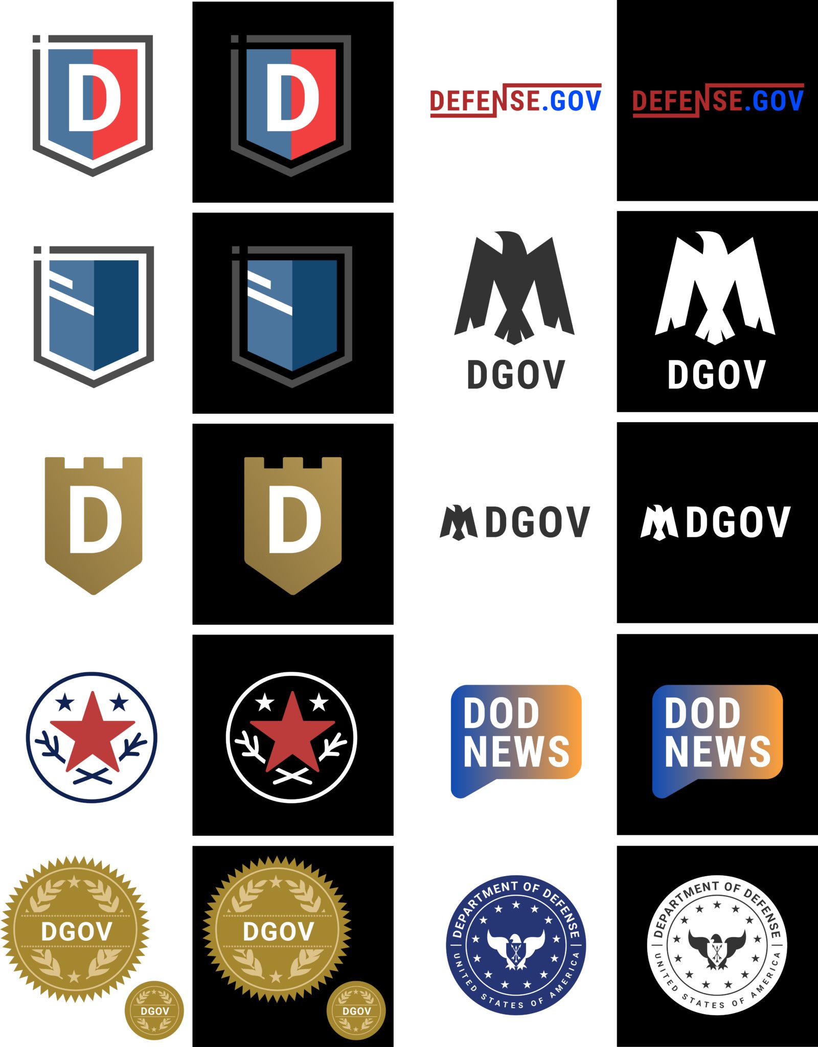
At this point in the process, my team received new and different information about the direction we were going. I received some positive feedback on eagle imagery, but constructive feedback on making it feel more lethal. This instruction led my next round of logos, which was extensive in revisions.

I spent a couple of weeks revising the final eagle logo. As you can see, it went through many variations and and I put extra time into making sure it was just right. Below, you can see the final logo I presented.
Recent Portfolios
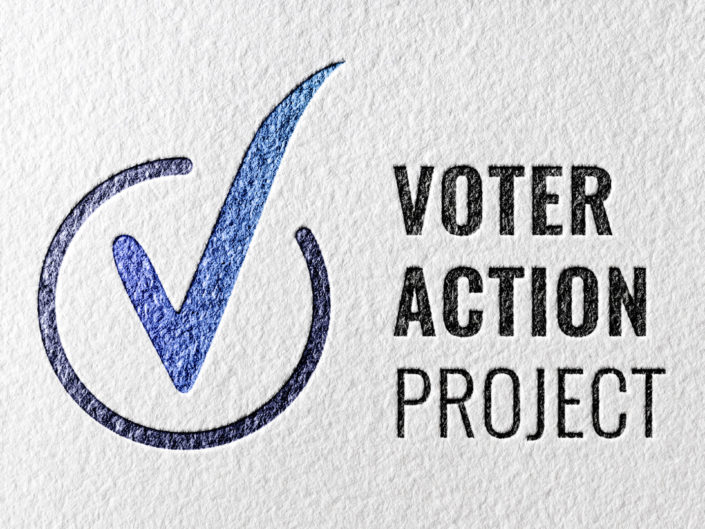
Voter Action Project

DoD Logo
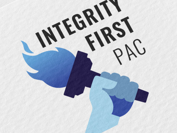
Integrity First PAC
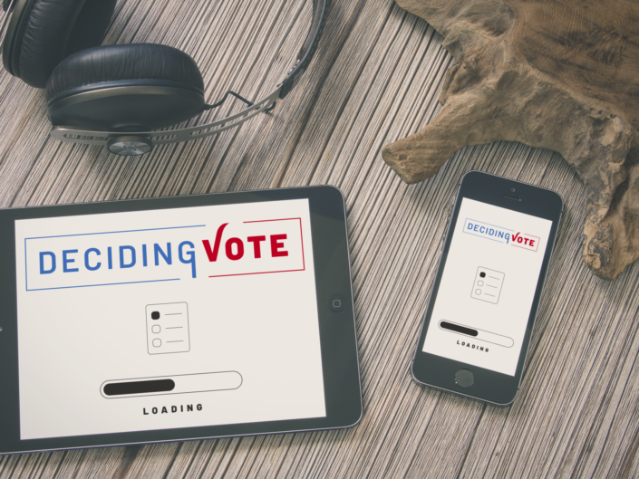
DecidingVote
- This error message is only visible to WordPress admins