
Date: Ongoing
Client: Defense.gov
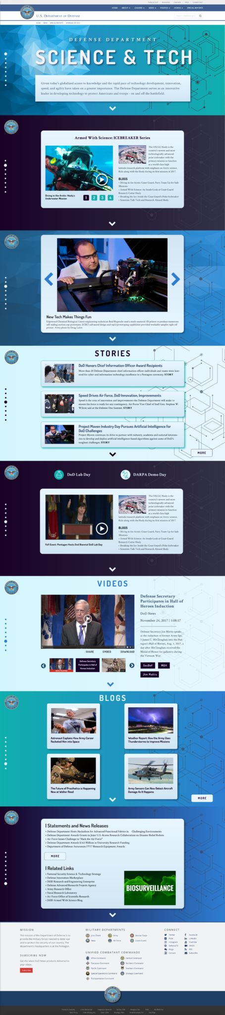
This website covers the scientific and technological advancements that the Department of Defense is making.

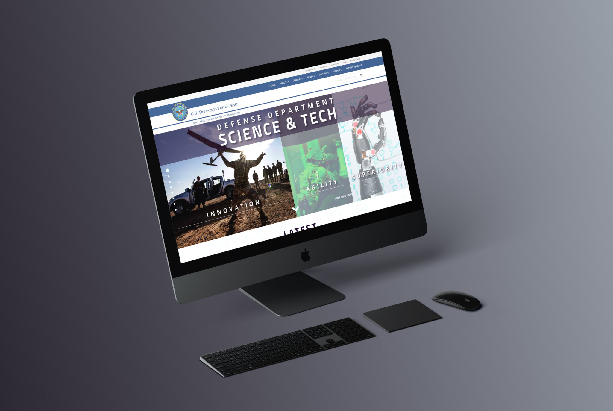
The first mockup of the Sci/Tech uses colors, styles, and trends designed to pull in a younger crowd. The target audience, millennials, will be able to explore the page by either scrolling down the page, clicking the down-facing chevron at the bottom of each sliding slice, or clicking on the navigational circles on the left-hand side.
This feeling of exploration and discovery reflects the content of the website, and the new colors and styling give it a fresh, modern feel.
This second design refined a few elements, after sharing with my peers. It was still very blue, however, and got an overhaul after the next round of revisions with the client.

When designing this wireframe, I took into consideration the feedback given by the stakeholders. With all of it incorporated into my sketch, I was able to lay it out quickly as a prototype. You can see my detailed notes as I received additional guidance in design meetings with my team.

This third design was actually the 6th mockup I did, and of that mockup, the 9th version! With many tweaks here and there coming from myself, my design team, and the client, this is the version we settled on and I launched into coding!

Recent Portfolios
Voter Action Project
DoD Logo
Integrity First PAC